
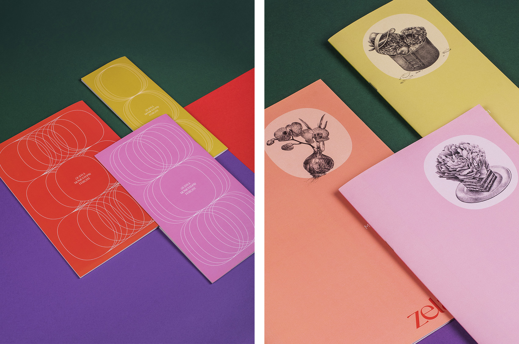

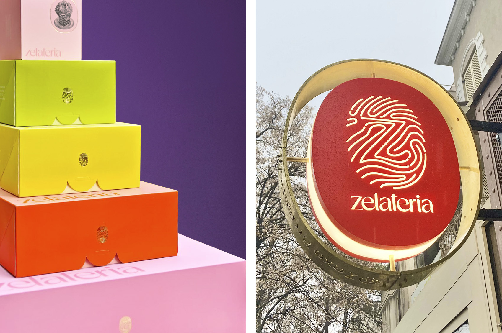

Two years and one business strategy workshop after the Zelateria 1 project, the brand took a new direction, and we had to rebuild everything from the ground up. With the same meticulous attention to detail, we reworked all the branding materials to visually convey the balance between relentless pursuit of excellence, the team’s approachable spirit, and the venue’s elegance—tailored for a new generation of luxury consumers.
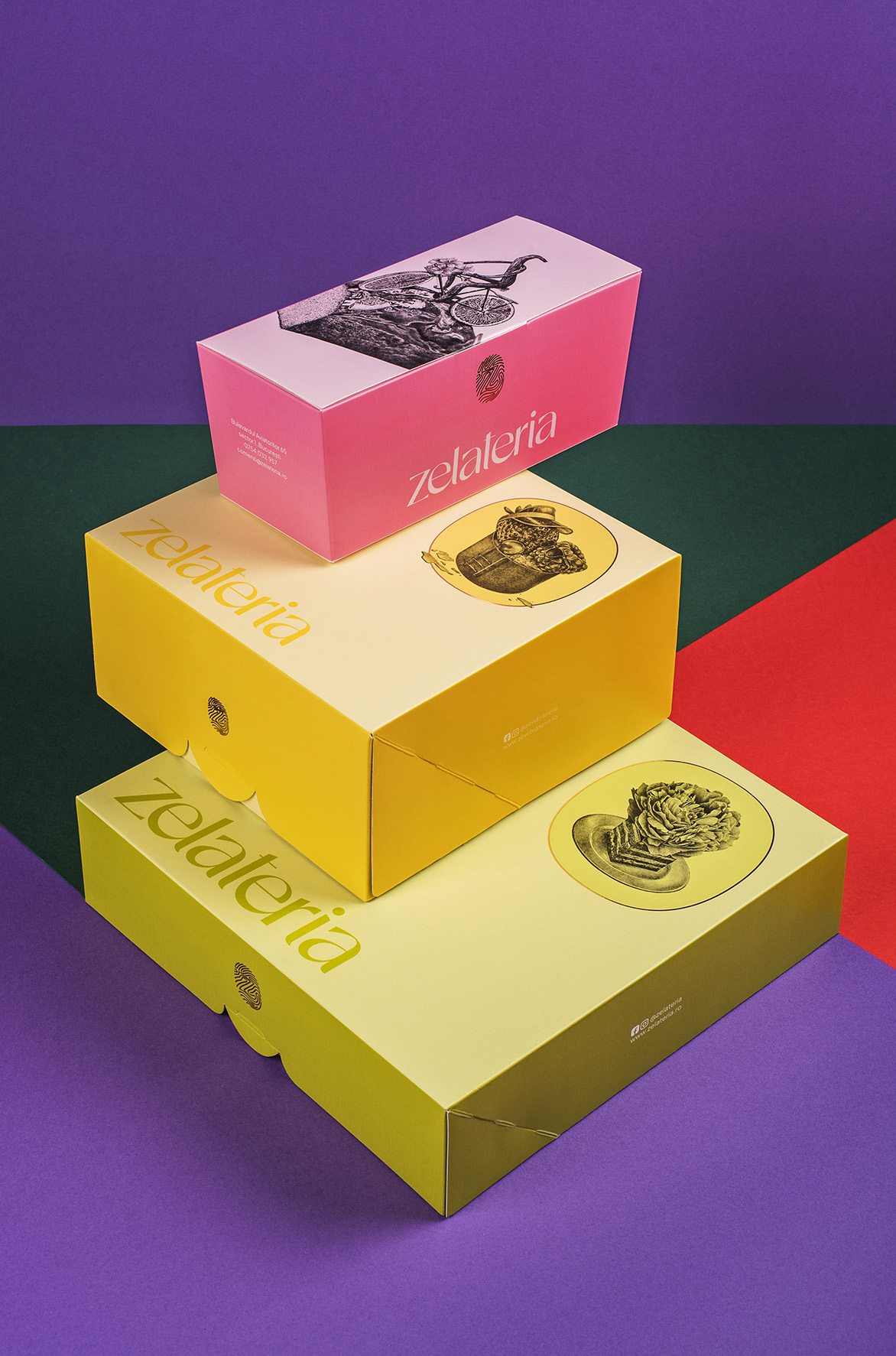
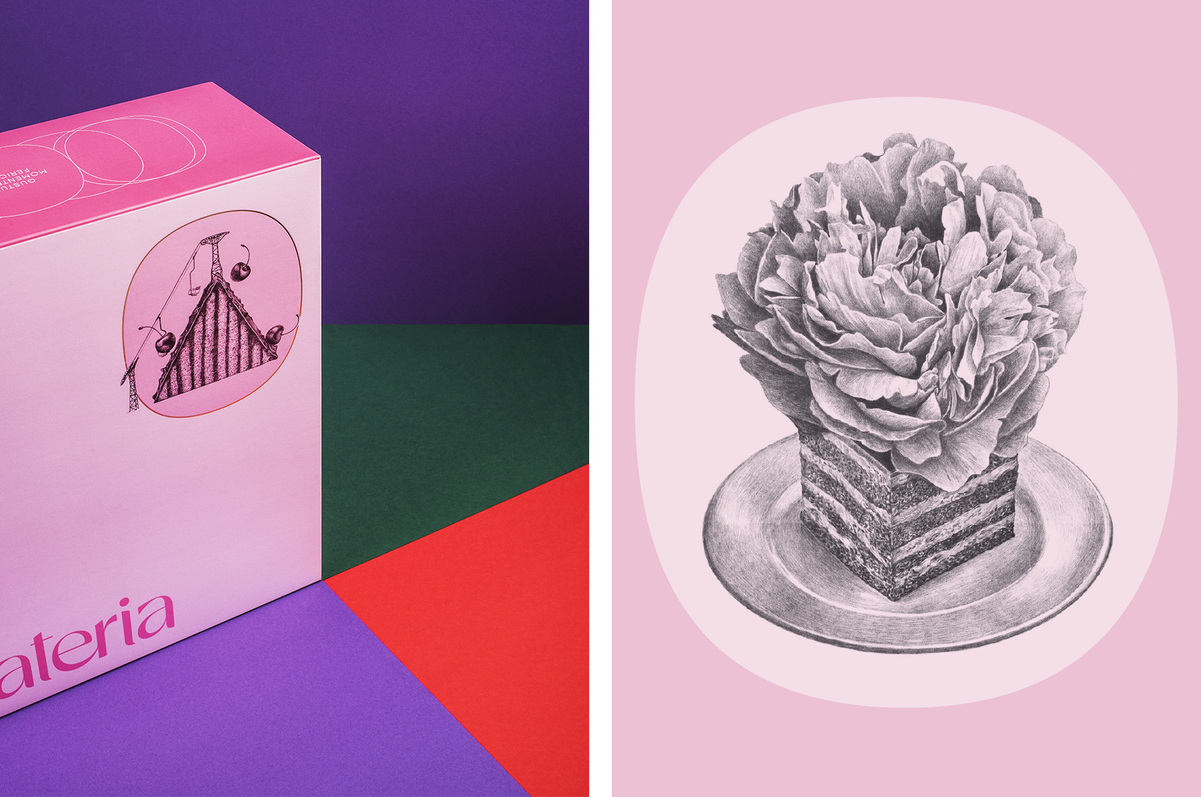
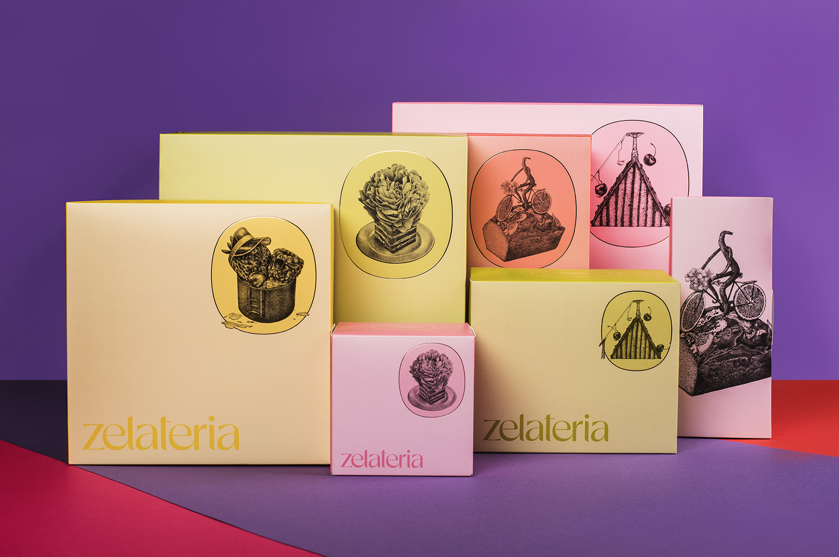
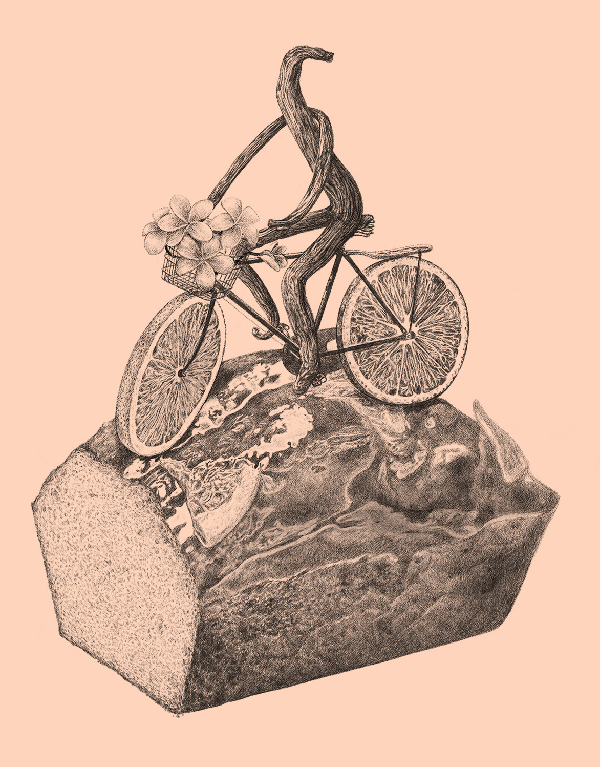
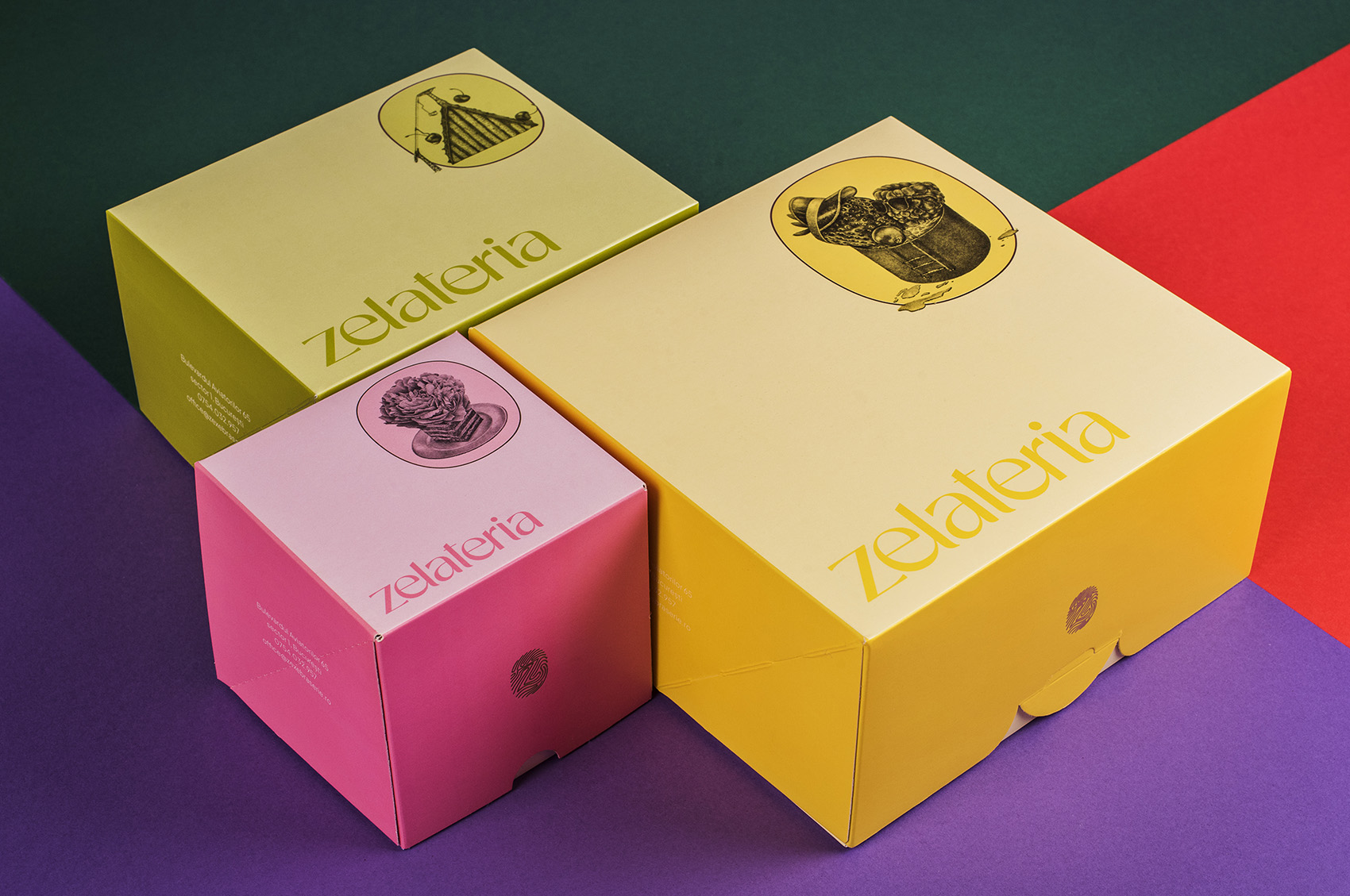
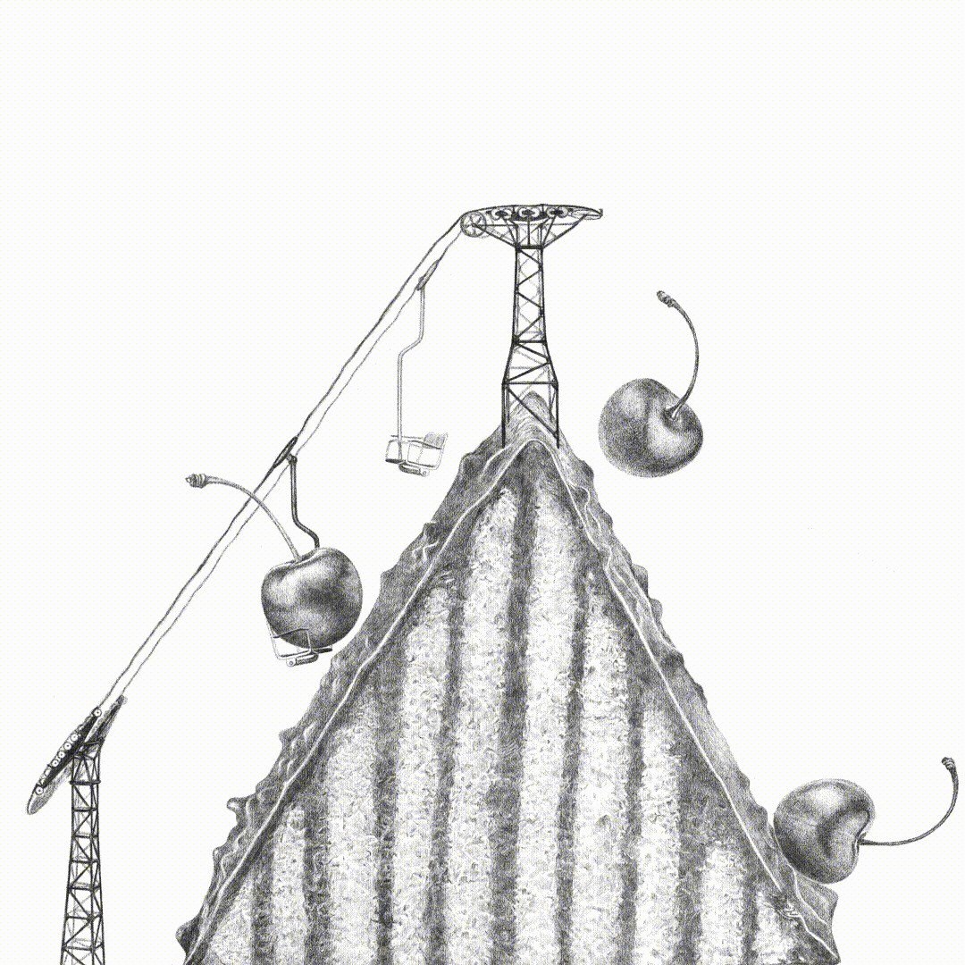
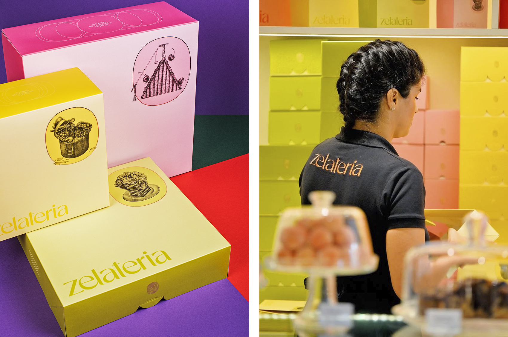
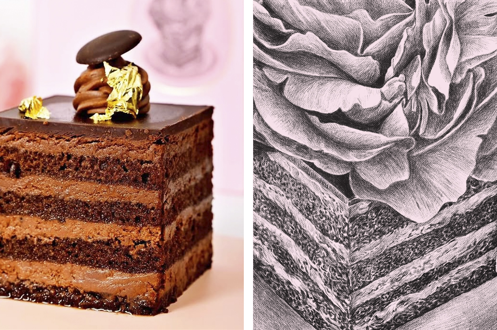
I created an elegant, fluid logotype paired with warm colours and a distinctive signature fingerprint, and I drew (kind of insisted on drawing) a set of highly realistic illustrations to mirror the Chef’s obsession with detail and perfection. I appreciated her patience too.
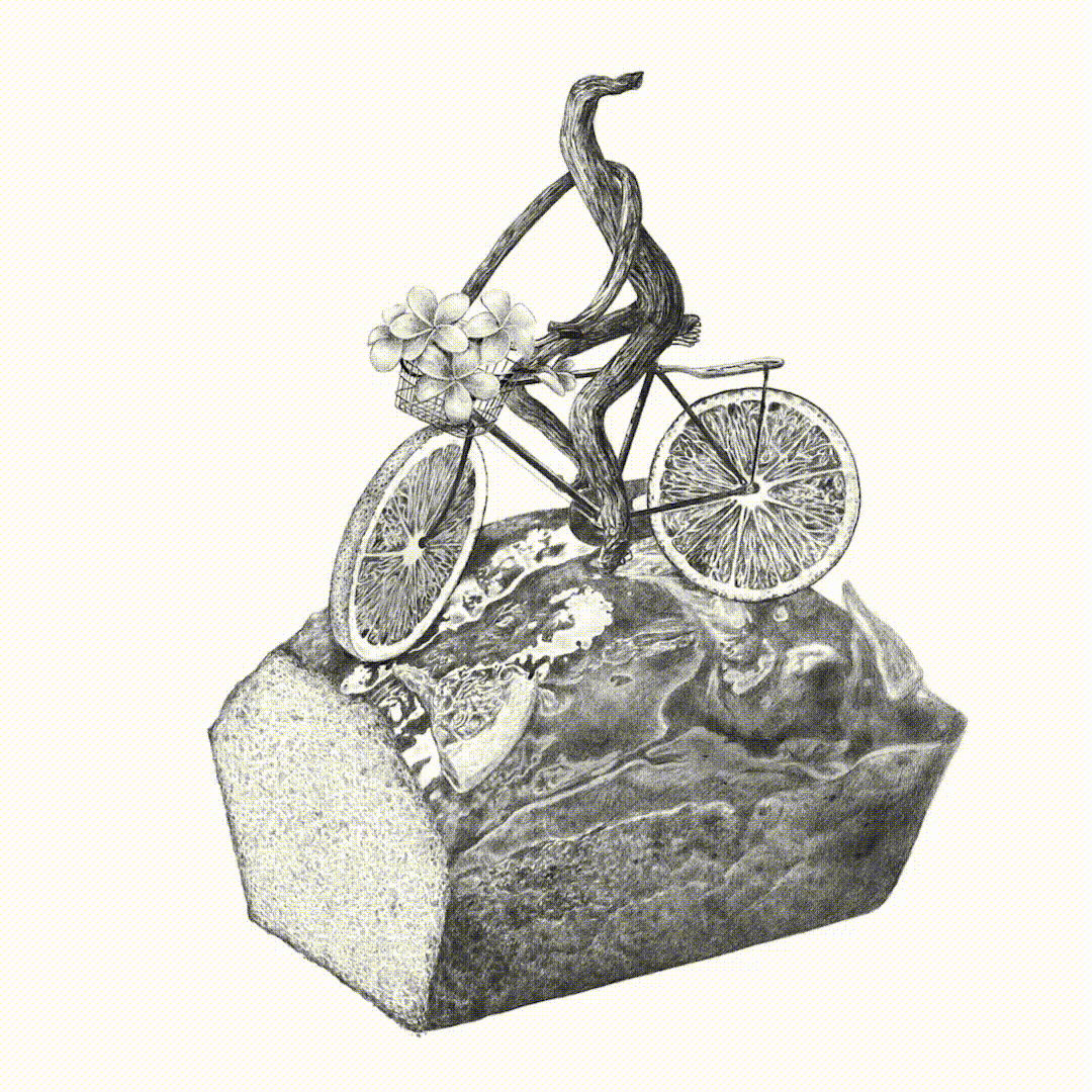
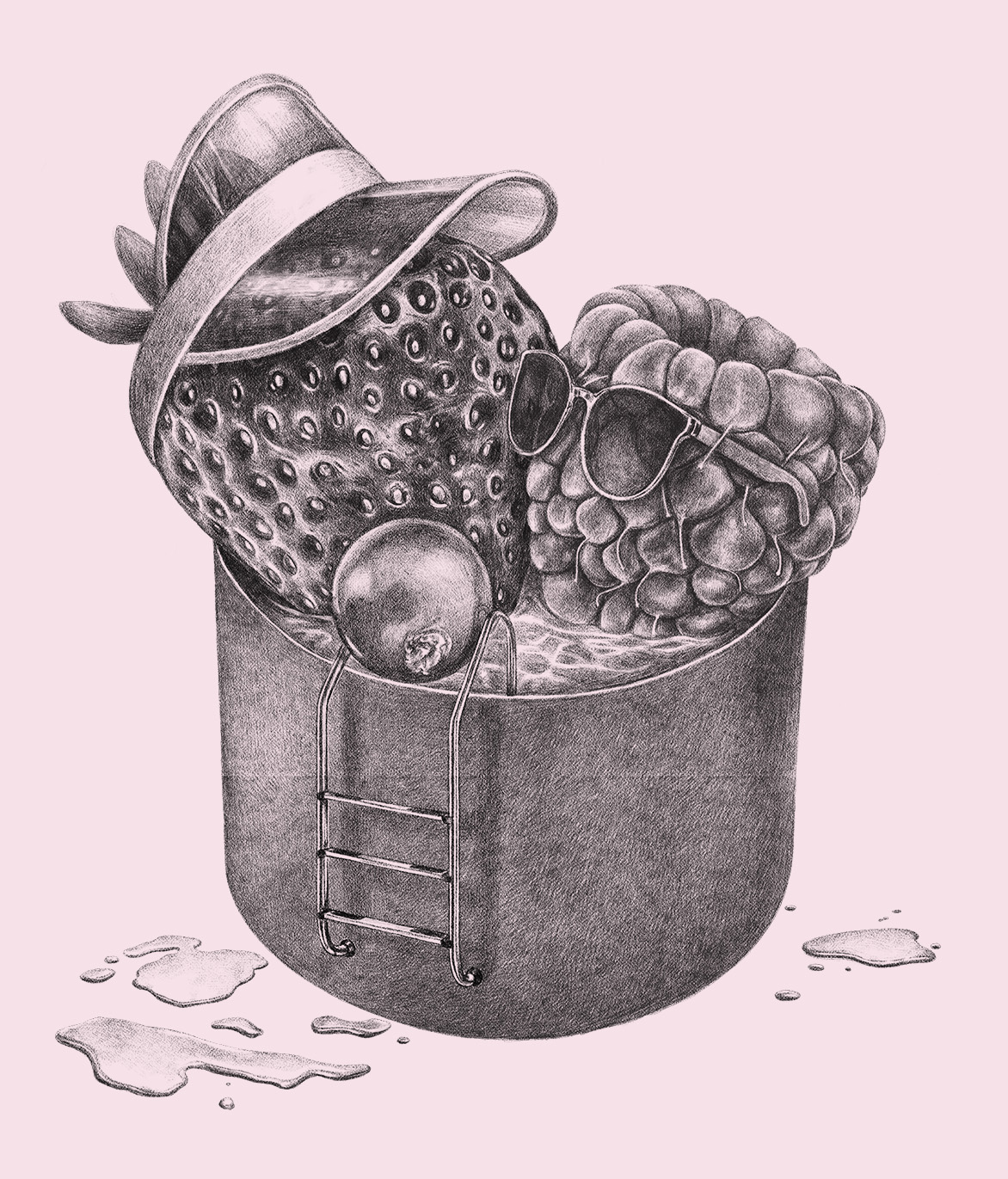
The illustrations were inspired by the shop’s pastries and cakes but reimagined with a surrealist twist to add an element of surprise, to create a visual narrative that complements the inherent beauty of each cake. To be more specific, my intention was to capture that moment when someone sees a beautiful cake, takes a bite and discovers a flavour that surpasses its beauty.
Typeface: Rosane from Sensatype Studio
Animations: Minerva To-Bu (emerging talent)
Some photos: Marius Sabău, courtesy of Zelateria
Outdoor signage: GSC Works
I created an elegant, fluid logotype paired with warm colours and a distinctive signature fingerprint, and I drew (kind of insisted on drawing) a set of highly realistic illustrations to mirror the Chef’s obsession with detail and perfection. I appreciated her patience too.
The illustrations were inspired by the shop’s pastries and cakes but reimagined with a surrealist twist to add an element of surprise, to create a visual narrative that complements the inherent beauty of each cake. To be more specific, my intention was to capture that moment when someone sees a beautiful cake, takes a bite and discovers a flavour that surpasses its beauty.
Typeface: Rosane from Sensatype Studio
Animations: Minerva To-Bu (emerging talent)
Some photos: Marius Sabău, courtesy of Zelateria
Outdoor signage: GSC Works