
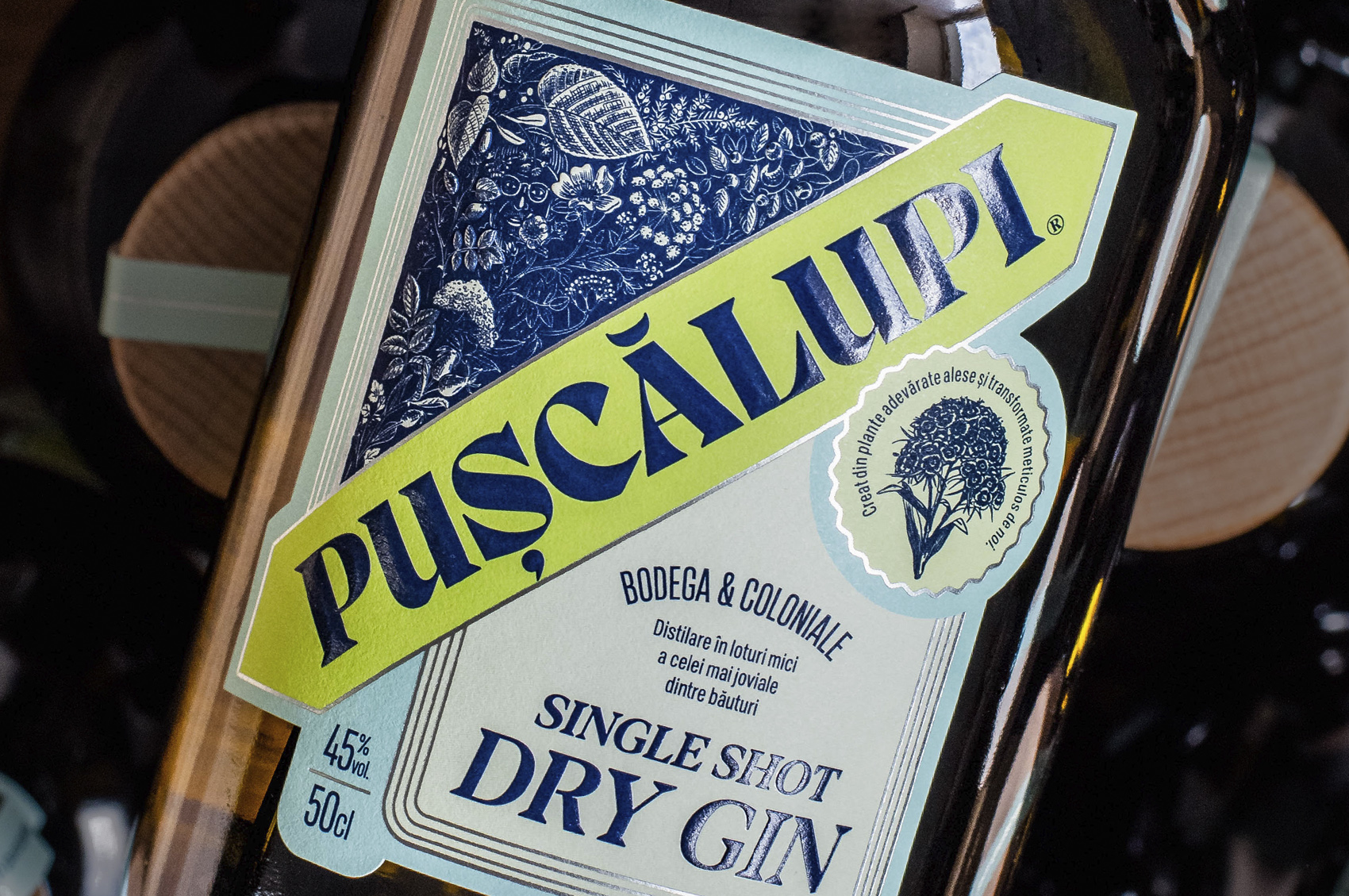
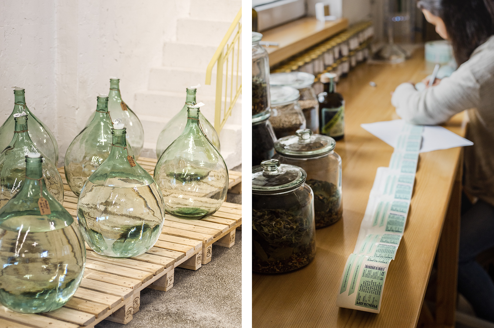

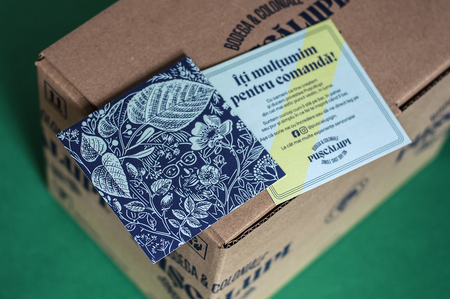

A premium single-shot-dry-gin with a strange name, distilled in small batches in a small moutain town and a client that beats me at the obsession for details. He applies the label manually on each of the 100 bottles of a batch.
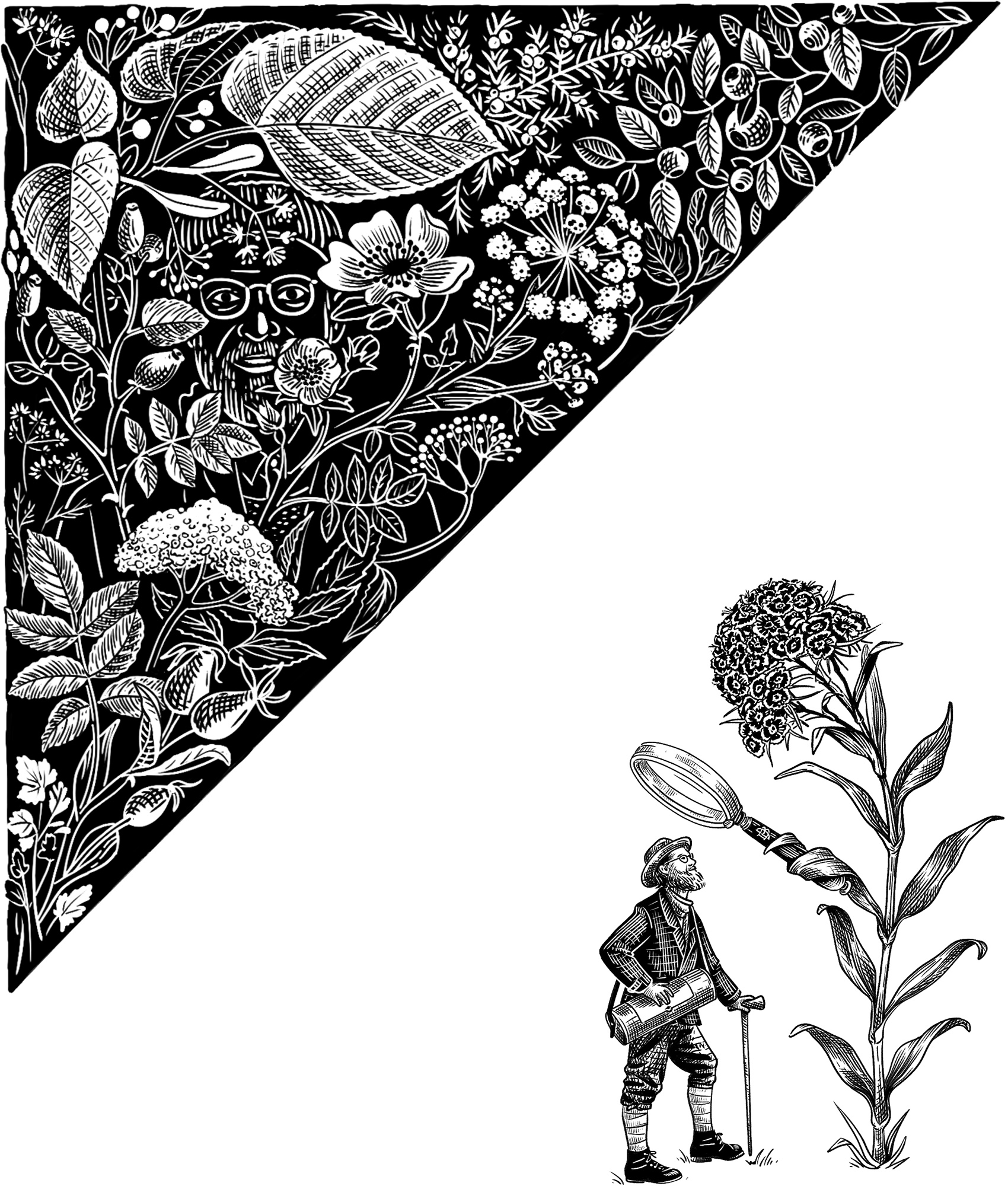
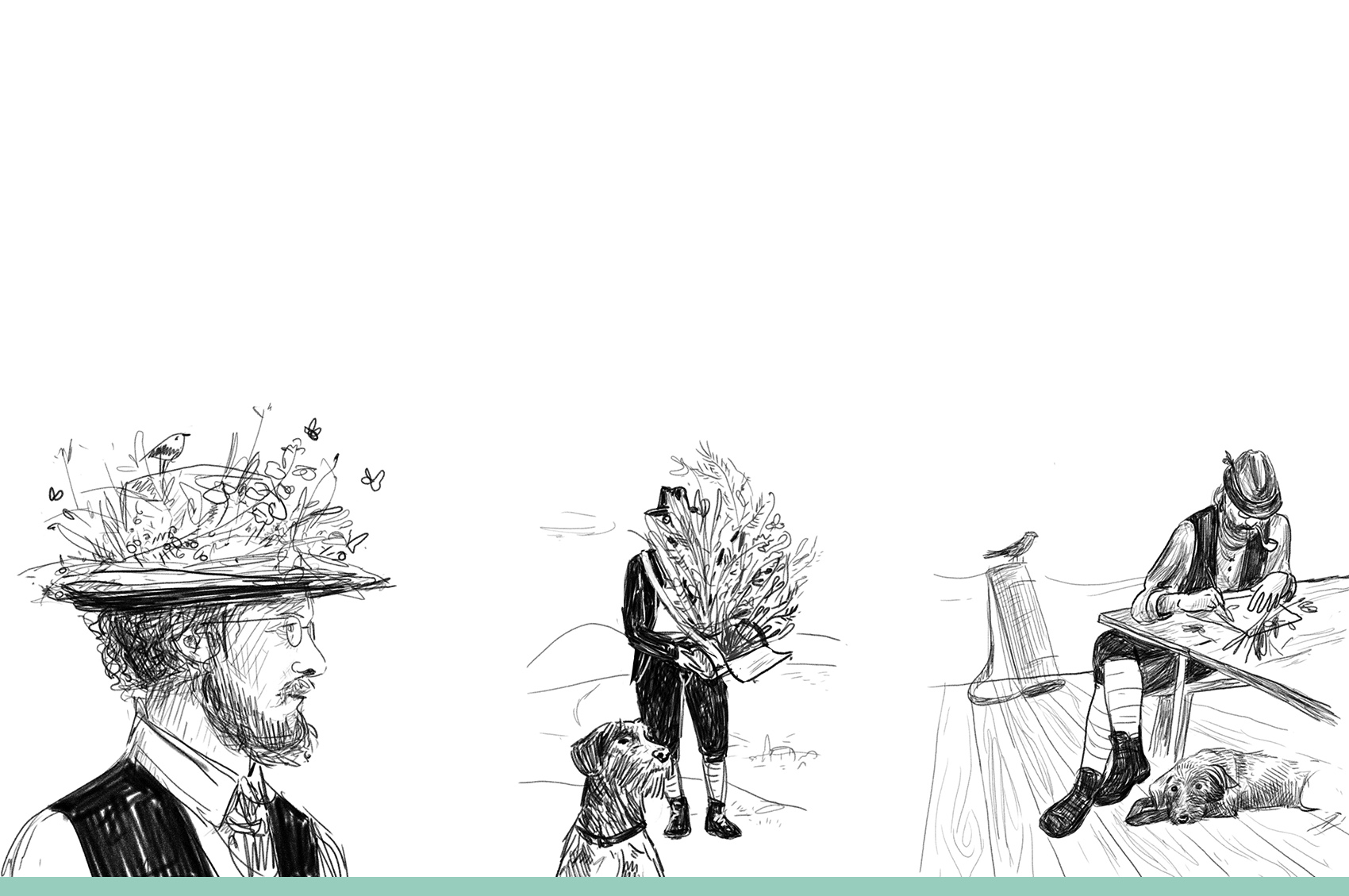
The strange name (roughly translated as “Shoot the Wolves”) was in fact a nickname of a mountaineer from the beginning of the 20th century, a guy that knew all the hills with all the paths and all the plants in the area - at that time called Das Burzenland. The man that helped the pioneer botanist Julius Römer, whose knowledge heritage is now distilled and veeery tasty.
The label design encapsulates that mix of early 1900’s small business advertising that used different shapes and typefaces with contemporary use of illustration, colours and printing techniques. The engraving style of the illustration, the typo and the small details about manufacture spread across the label that might lead to a vintage look are counterbalanced by the bold (yet delicate) colours and the precision of the emboss and silverfoil. It keeps references to the past and the places, yet it is relevant to the contemporary consumer.
Typefaces: MigraExtrabold from PangramPangram, Blacker Pro from Zetafonts, Archivo
Print: IPPU
Photography: Aura Petrascu for Pușcălupi
Strategy: Ioana Danu