

I never thought people working in tax and audit business could be cool and up-to-date beyond, maybe, driving a Tesla. In Romania the domain looks stuck in time in the previous century. NOA are young, have the knowledge and know the system. NOA got an amazing creative strategy director that interviewed for a month or more both NOA themselves and their clients to find out how they were percieved. And the keyword was “agility”.
So I proposed a more conceptual identity - an elastic logo that stretches horizontally and vertically, combined with multiple styles of two fonts. The perception is that the branding adapts to any size exactly the way NOA adapts to any of their clients’ needs. The elasticity is present in the header of the new designed website noagroup.ro and in static instances on business cards and online communication.
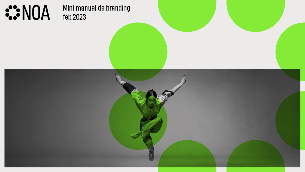
We also took a non-conventional approach with the imagery style, where we added very stylish black and white photography of agile dancers and crisp green accents.
For the website I also designed a set of icons to represent each of their services.
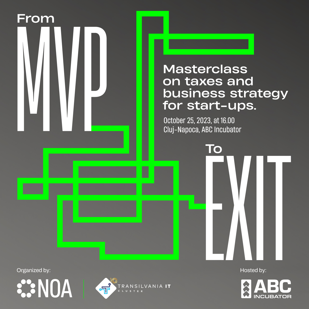
Furthermore, for a small B2B event organized by NOA, I created a short video intro, beautifully animated by mad.animator.
The new identity didn’t scare anybody off, quite on the contrary, they made a few more contracts in the first month after the relaunch.
Creative strategy and copywriting Ema Prisca
Business cards crafted by fabrik
Elastic logo crafted by rivulet studio
Type set in Heading Now from Zetafonts and Archivo from Google Fonts.
noagroup.ro
