Cap 25+
identity, art direction, illustration
2025


I was part of CAP (multi-awarded independent creative agency ever since) in all its shapes, from 1998 until 2016. They are still my second family.
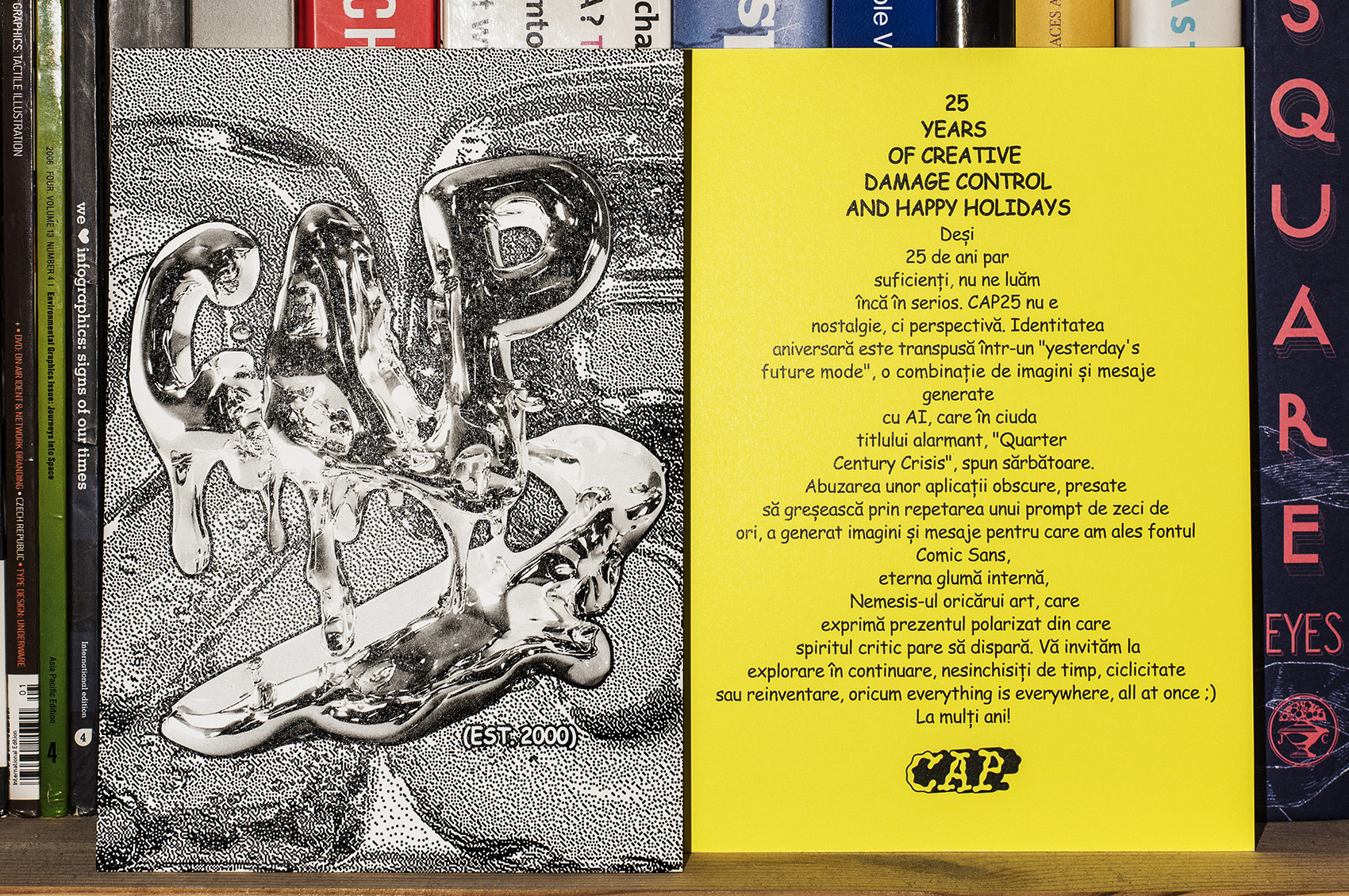
CAP has helped shape mindsets in our industry, consistently questioning prejudices, and almost every project has resulted in a small social study. At 25, we’re old enough to have a (rich) past and still self-aware enough not to take ourselves too seriously. It’s not about nostalgia — it’s about perspective.
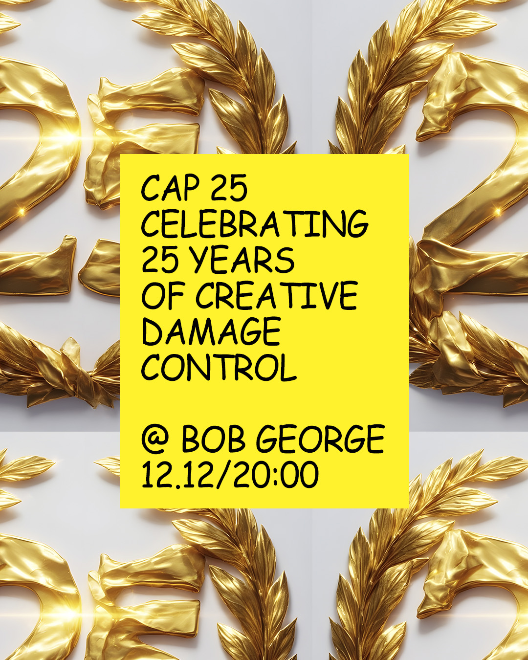
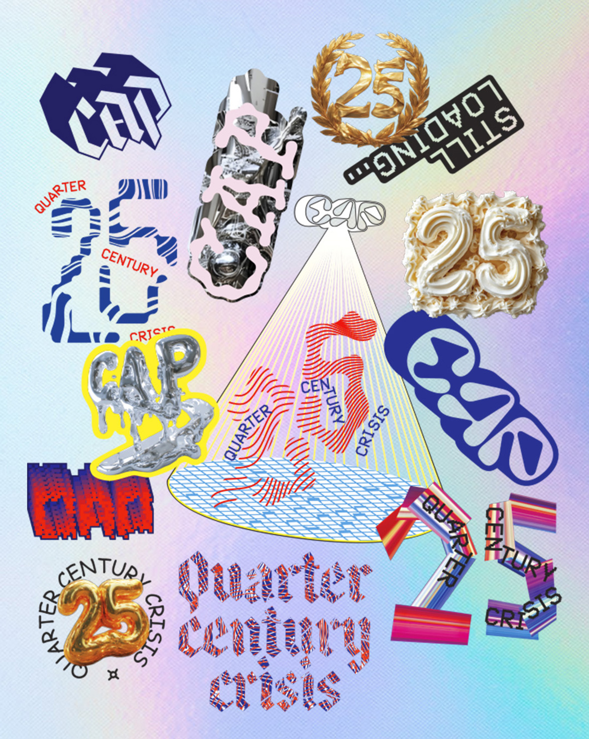
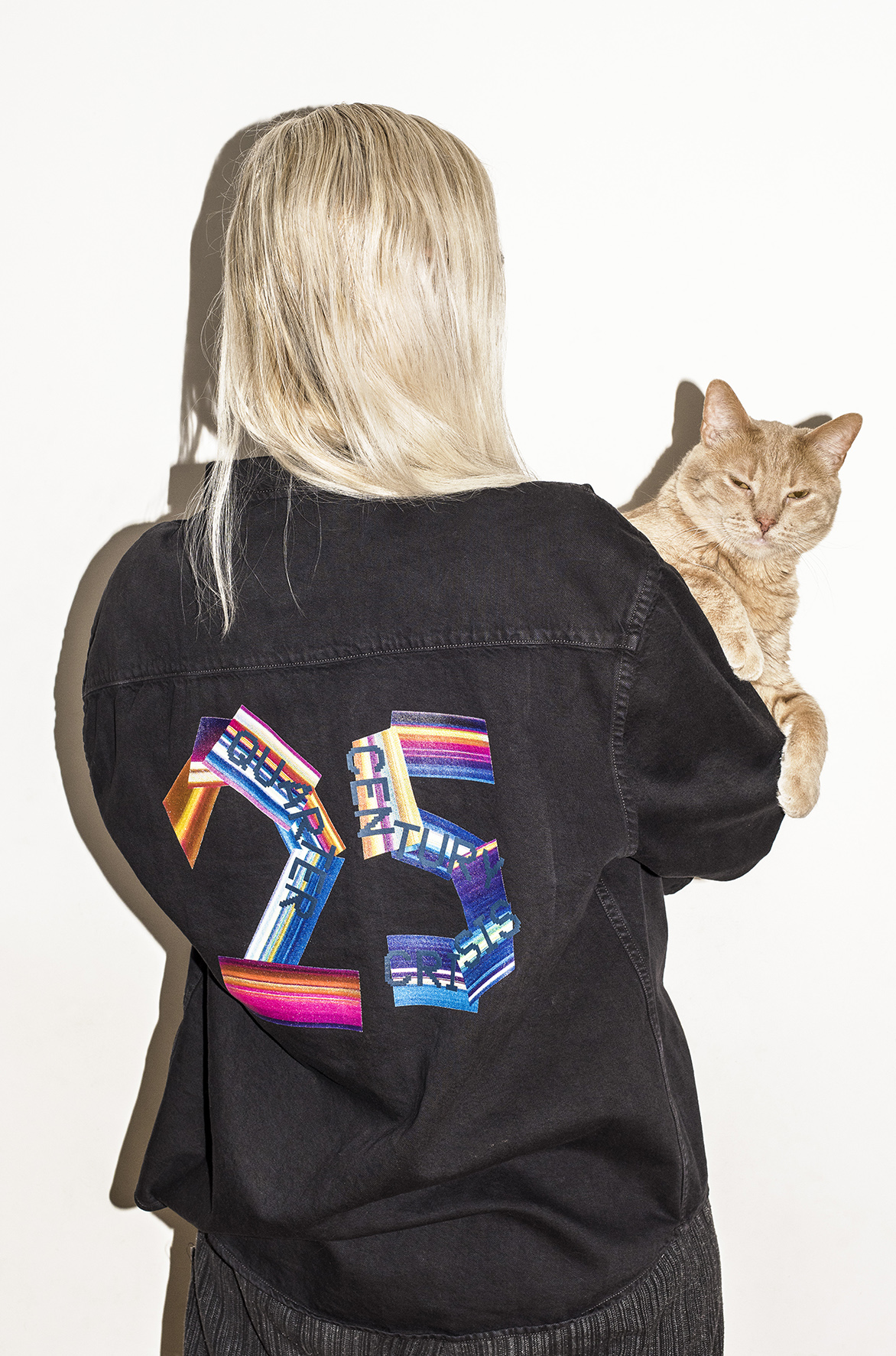
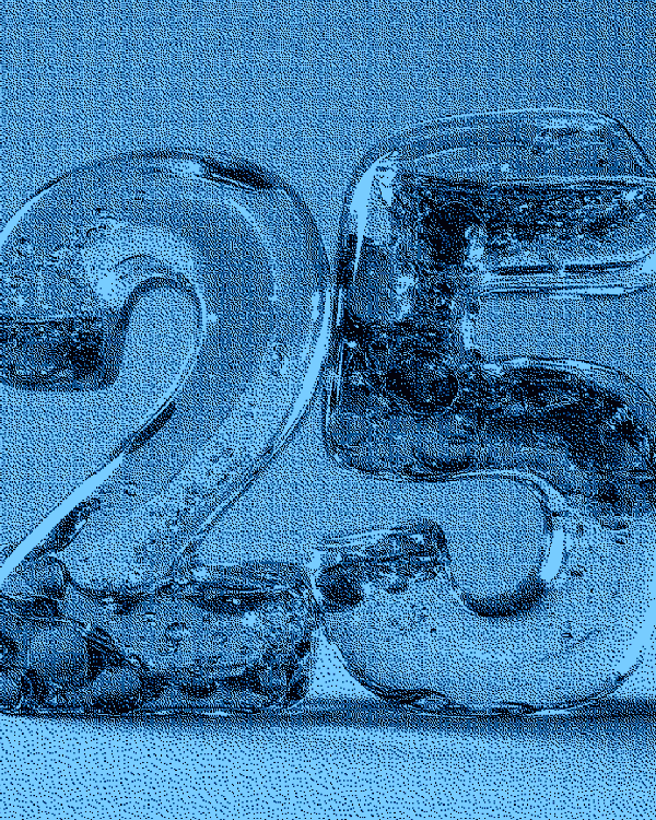
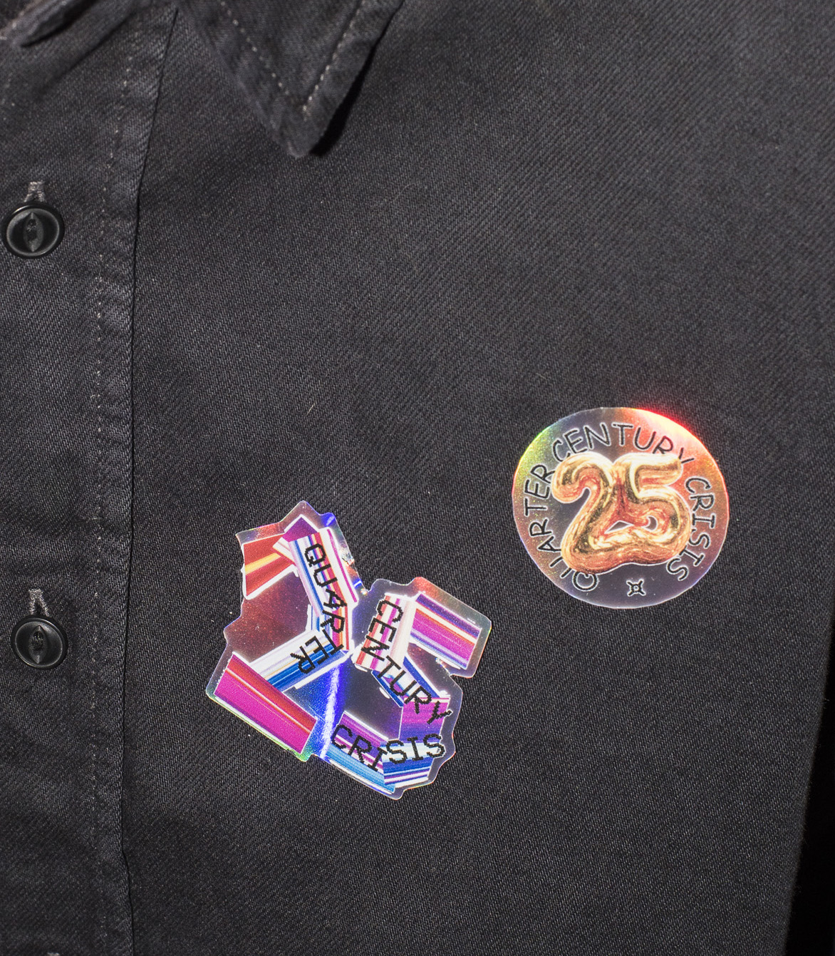
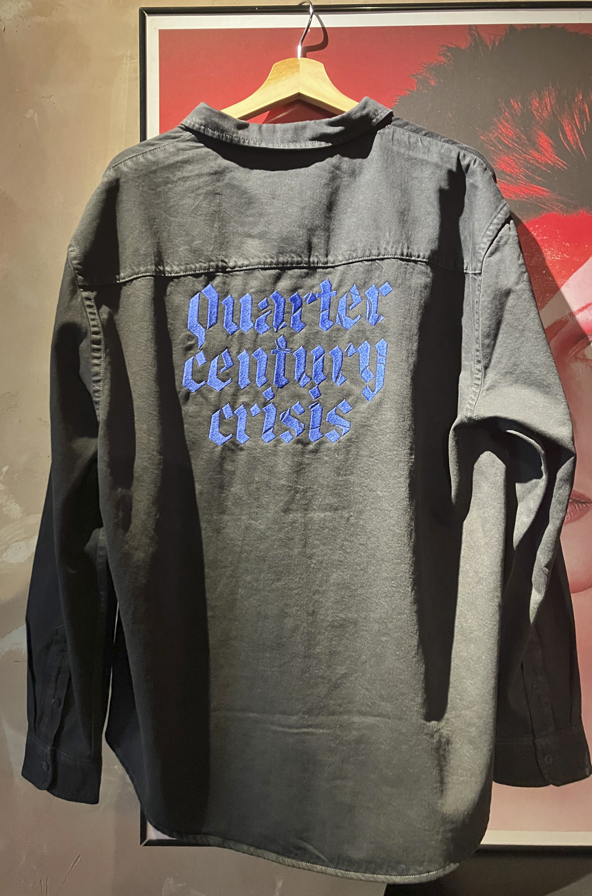
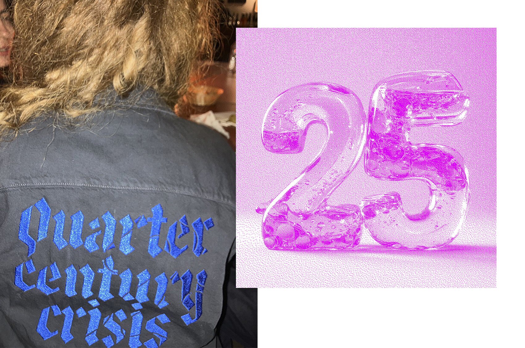
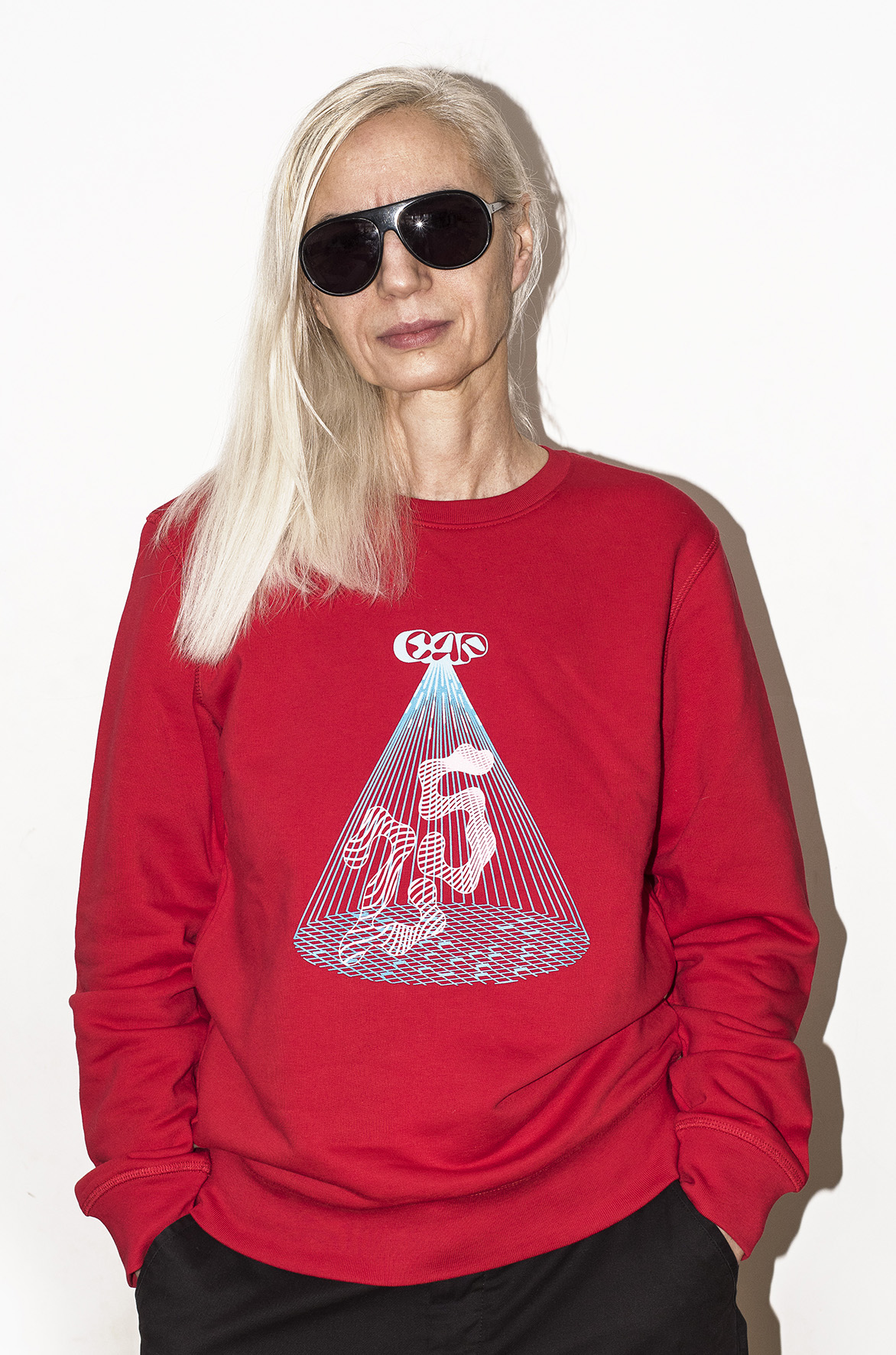
For this anniversary identity, I explored the idea of time — of cyclicality and reinvention. I conveyed the 25-year journey through a dynamic logo, like a sundial with 25 segments, whose shadow rotates and shifts depending on each instance. Twenty-five moments, represented through different fonts, each symbolizing one of CAP’s multiple traits over time: uninhibited, ironic, experimental, nonconformist, reliable, subtle, culturally attuned — traits that have remained largely the same.
There’s also the Comic Sans moment — our internal joke, the nemesis of any art director — which could easily express the polarized present in which critical thinking seems to be fading.
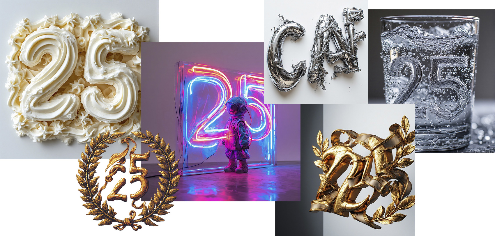
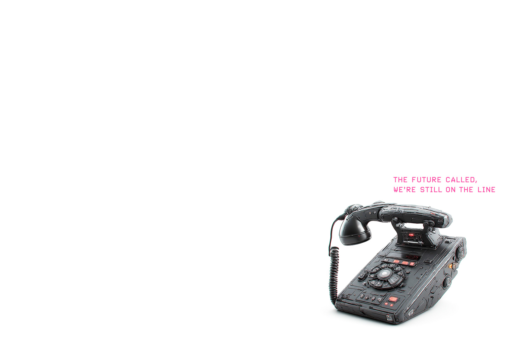
All this theory is translated visually into a kind of “yesterday’s future” mode — a combination of the most bizarre variations and AI-generated imagery — to underline the fact that despite the alarming headline of “crisis,” this is an anniversary, so we’re allowed to have fun. I prompted obscure apps and pushed them to fail by making them repeat the same prompt dozens of times, until I thought I might exhaust them.
For me, it’s a slightly alarming fact that some visually untrained people genuinely take GPT-generated graphic proposals at face value.
➽ CAP
CAP has helped shape mindsets in our industry, consistently questioning prejudices, and almost every project has resulted in a small social study. At 25, we’re old enough to have a (rich) past and still self-aware enough not to take ourselves too seriously. It’s not about nostalgia — it’s about perspective.
For this anniversary identity, I explored the idea of time — of cyclicality and reinvention. I conveyed the 25-year journey through a dynamic logo, like a sundial with 25 segments, whose shadow rotates and shifts depending on each instance. Twenty-five moments, represented through different fonts, each symbolizing one of CAP’s multiple traits over time: uninhibited, ironic, experimental, nonconformist, reliable, subtle, culturally attuned — traits that have remained largely the same.
There’s also the Comic Sans moment — our internal joke, the nemesis of any art director — which could easily express the polarized present in which critical thinking seems to be fading.
All this theory is translated visually into a kind of “yesterday’s future” mode — a combination of the most bizarre variations and AI-generated imagery — to underline the fact that despite the alarming headline of “crisis,” this is an anniversary, so we’re allowed to have fun. I prompted obscure apps and pushed them to fail by making them repeat the same prompt dozens of times, until I thought I might exhaust them.
For me, it’s a slightly alarming fact that some visually untrained people genuinely take GPT-generated graphic proposals at face value.
➽ CAP