


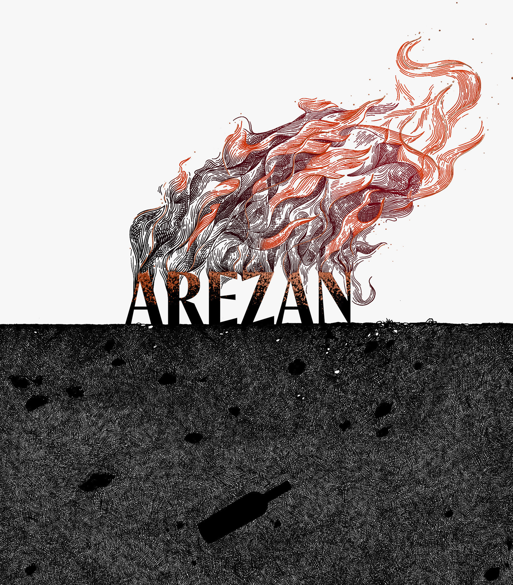
I had the chance to redesign this premium label, and this is one of the versions that went to print trials. I’m glad it did, because the printing house added some beautiful details — like the coarse texture of the soil and the fine hot-foil ‘ashes’ — giving the label a tactile feel, even for the fire.
Unfortunately, it never made it to the market. I had to go back to square one and start over, but I remain very fond of this design. It tells a visual story of the mythical ritual of Arezan — it’s wild and rough yet delicate and alluring, dynamic in the upper half and still in the lower half, while the buried bottle and rocks seem to float.
Print: IPPU